Design System for Grocery Chain
Created a comprehensive design system for a major grocery chain's digital ecosystem, unifying their e-commerce platform, loyalty program, and in-store experiences. The system needed to support high-frequency promotional content while maintaining brand consistency across web, mobile, and in-store touchpoints.
My Role
Lead Design System Designer — responsible for component architecture, promotional card systems, documentation, and ensuring seamless integration across digital and physical retail experiences.
The Challenge
The grocery chain operated multiple digital platforms—web, iOS, Android—with inconsistent design patterns and duplicate components. Marketing teams needed to launch weekly promotions quickly, but the lack of standardized components created bottlenecks and inconsistent customer experiences.
Additionally, the system needed to support seasonal campaigns (Thanksgiving, holidays), loyalty program features (Club memberships, BOGOs), and core e-commerce functionality (search, cart, shopping lists) while maintaining the brand's friendly, community-focused identity.
Strategic Approach
I conducted an audit of existing digital properties to identify common patterns and pain points. Working closely with product, marketing, and engineering teams, I prioritized components that would have the highest impact on both customer experience and team velocity.
The system was structured around three core pillars:
- Foundation: Color palette, typography, spacing, and elevation that reflected the brand's warm, approachable personality
- Core Components: Buttons, inputs, cards, modals, and navigation elements optimized for both browsing and transactional flows
- Promotional Templates: Flexible card systems for BOGOs, seasonal campaigns, and weekly ads that marketing could easily customize
Component Architecture
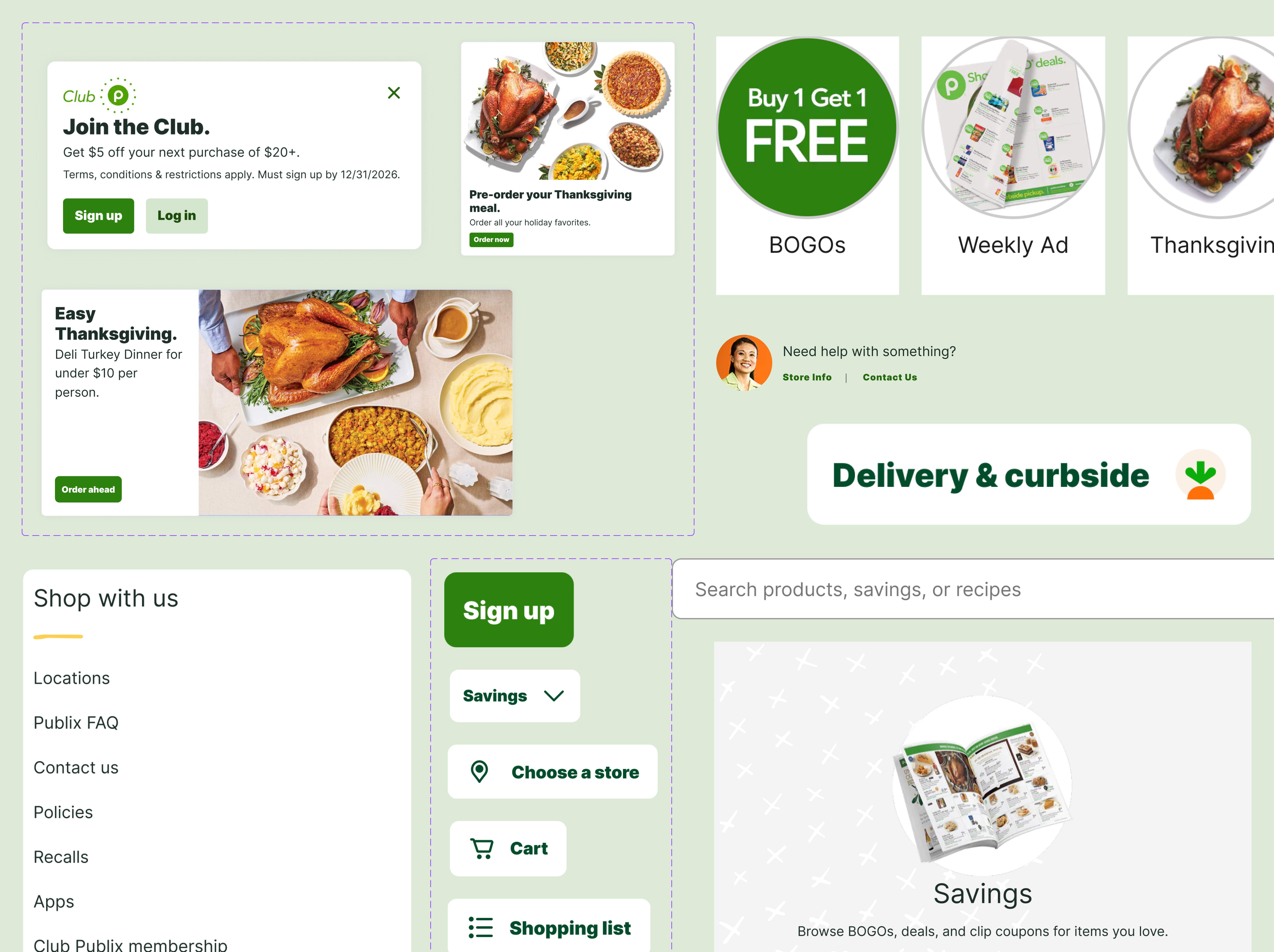
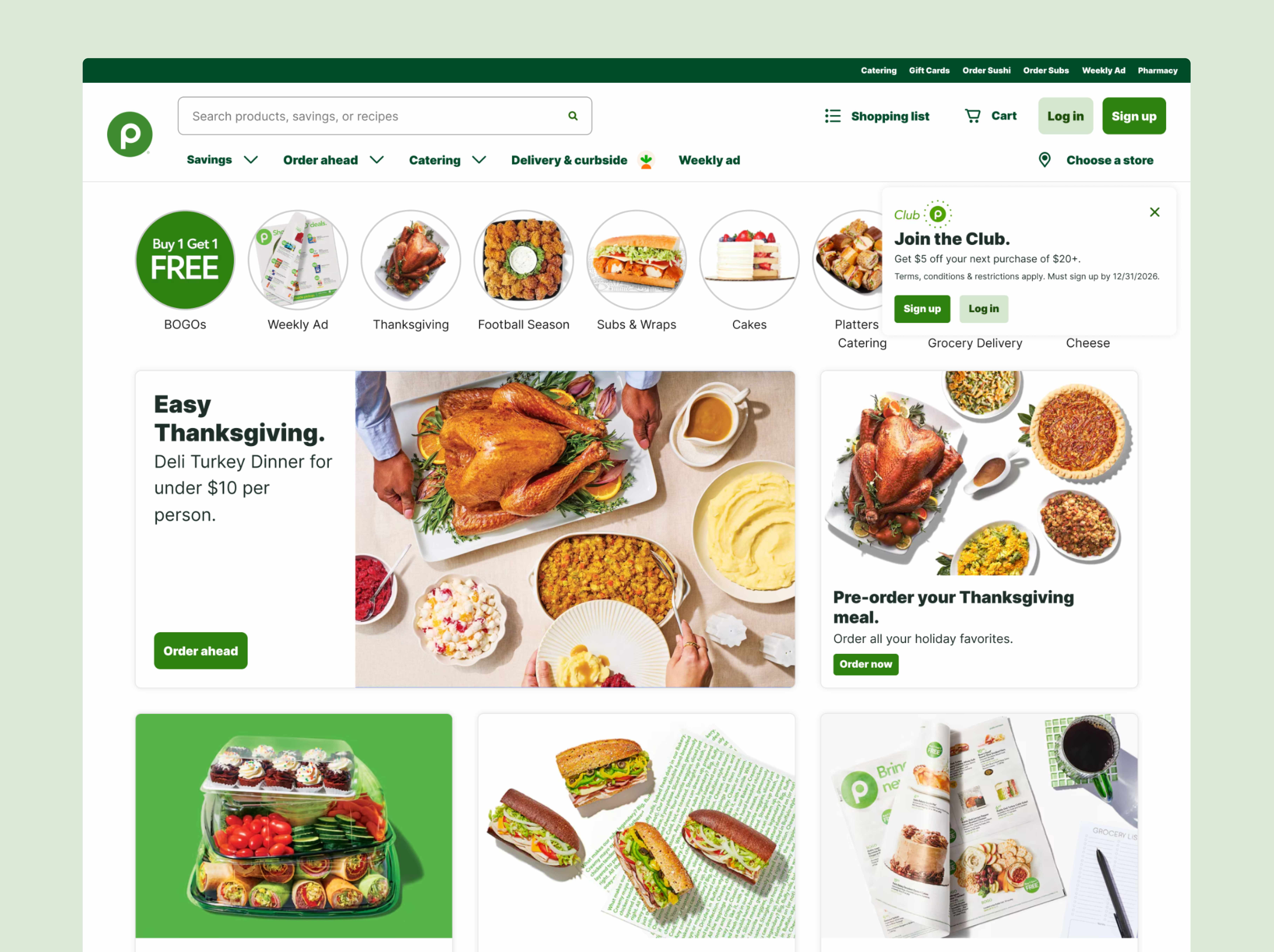
The design system featured specialized components tailored to grocery retail needs. Promotional cards were designed with multiple variants to handle different offer types—BOGOs, percentage discounts, seasonal bundles—while maintaining visual consistency. Each card included clear CTAs and imagery spaces optimized for food photography.
Navigation components were built to support complex information architecture, including store locators, shopping lists, savings trackers, and cart management. The system included responsive patterns that gracefully scaled from mobile to desktop, ensuring customers had a consistent experience whether shopping on their phones in-store or planning meals at home.
Membership and loyalty components (Club signup modals, savings displays, pricing tiers) were designed to feel integrated rather than promotional, encouraging enrollment without disrupting the shopping experience.
Color System & Accessibility
The color palette balanced the brand's signature green with a broader range of accent colors for different promotional categories. Warm tones were used for seasonal campaigns (Thanksgiving, holidays), while the primary green maintained brand recognition across core shopping experiences.
All color combinations met WCAG AA accessibility standards, ensuring that promotional content and pricing information remained readable for all customers. Special attention was paid to color contrast in pricing displays and call-to-action buttons, as these were critical conversion points.
Cross-Functional Collaboration
I partnered closely with marketing teams to understand their weekly campaign workflows and created templates that reduced promotional asset creation time from days to hours. Engineering teams received detailed documentation with code snippets, responsive behavior specs, and accessibility guidelines.
Regular design reviews with stakeholders ensured the system remained aligned with business goals while maintaining design excellence. I also conducted training sessions to help teams adopt the new system and understand best practices for component usage.
Impact & Results
The design system significantly accelerated digital campaign launches, enabling marketing teams to create and publish promotional content with minimal design support. The standardized promotional card system meant weekly ads could be produced in a fraction of the previous time while maintaining brand consistency.
Customer-facing impacts included improved navigation clarity, faster page load times due to optimized component architecture, and higher conversion rates on promotional offers. The unified experience across platforms reduced customer confusion and increased engagement with loyalty program features.
The system successfully scaled to support seasonal campaigns, new product categories, and regional variations while maintaining a cohesive brand experience. Engineering teams reported faster development cycles and fewer design-related bugs due to the comprehensive documentation and clear component specifications.